MADRE
IDENTITY & PACKAGING
2017
Madre is a small product brand that is focused on creating meaningful everyday objects. A brand that values the details, the rawness of each material, and the value that the human hand can add to each piece.
The brand expresses its love for objects, from traditional to contemporary, from artistic to highly functional, from minimal to kitsch, and advocates their high influence in our life and routine. With that in mind, they love to design objects that look for comfort and joy in everyday moments.
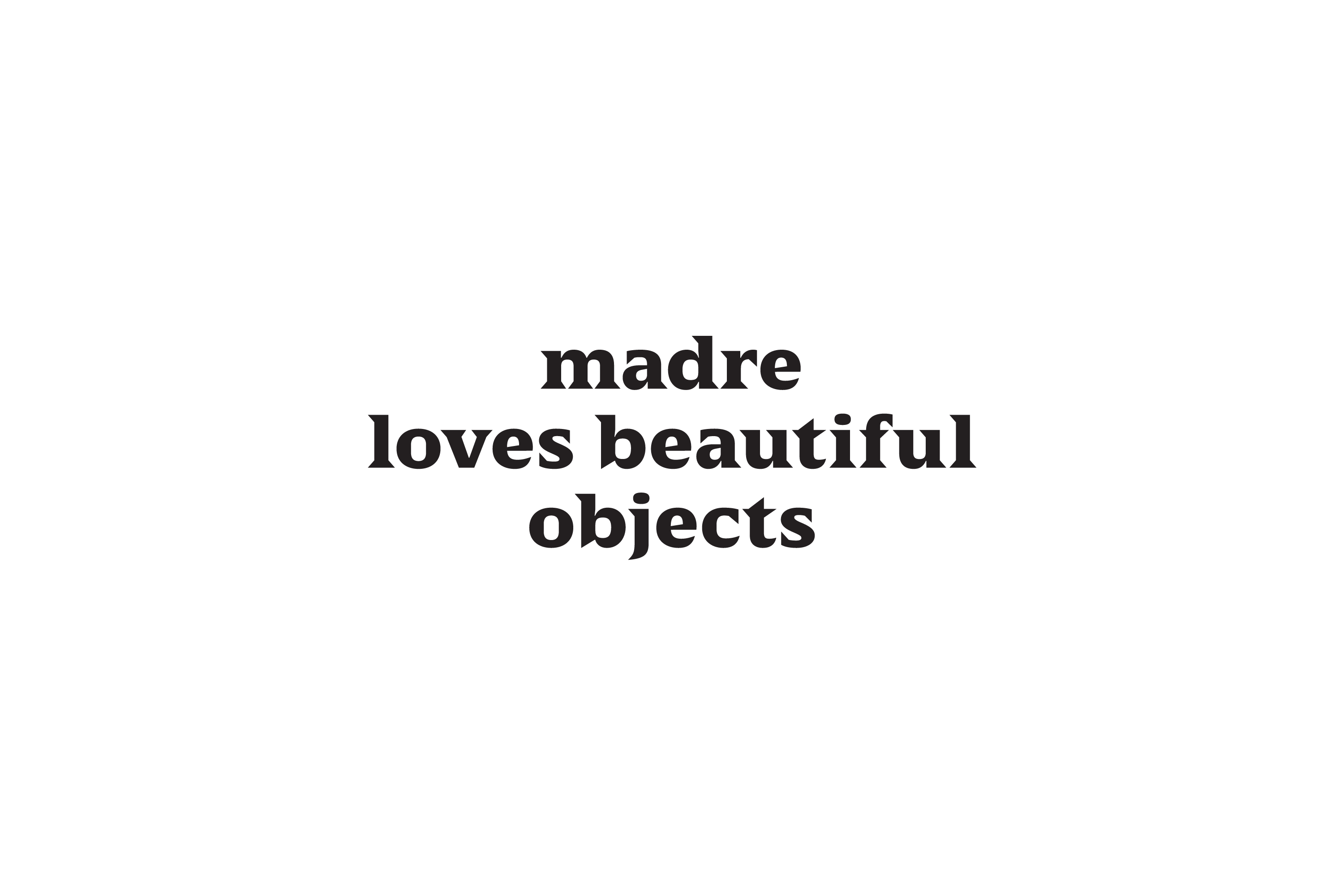
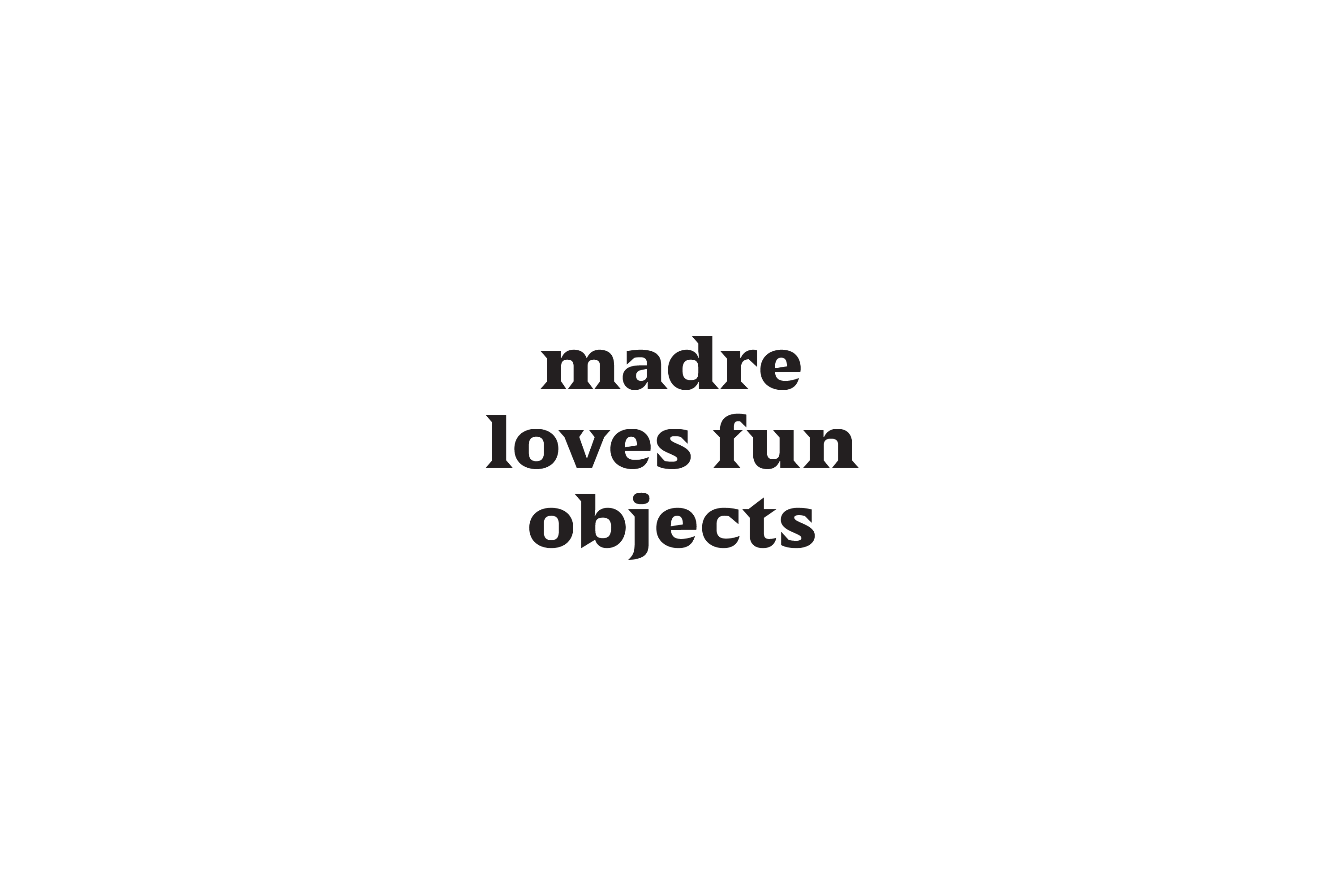
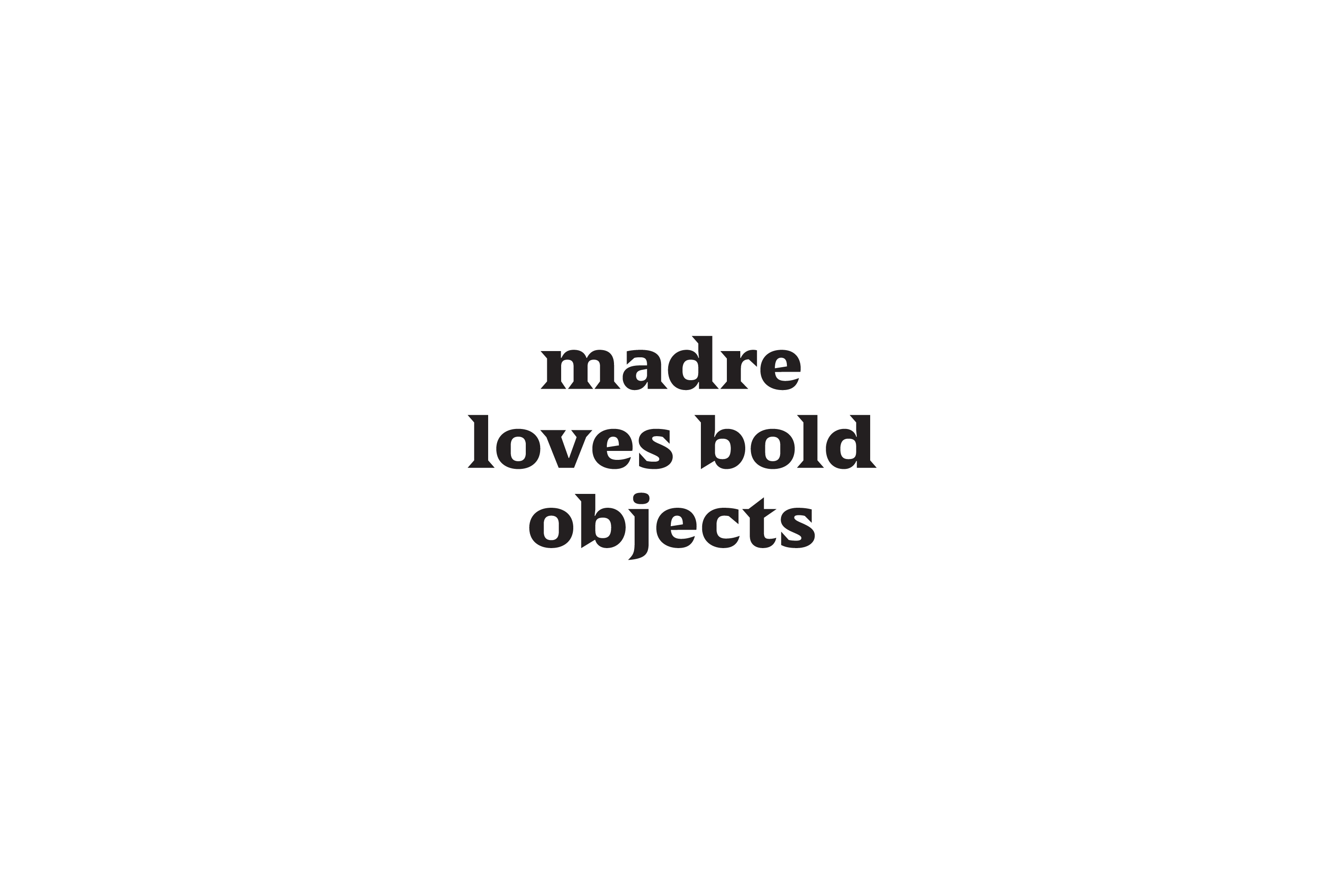
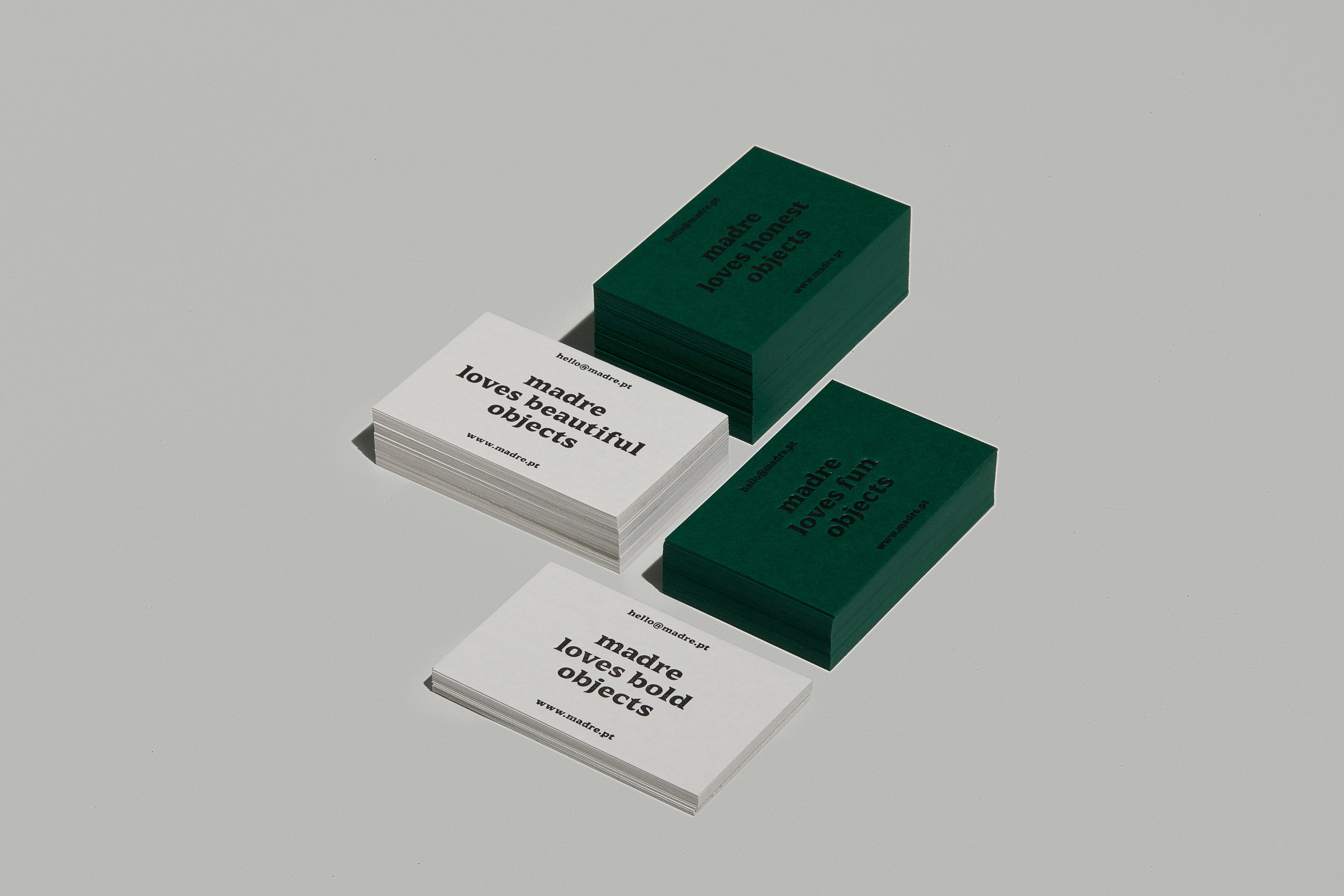
Madre copywriting represents the love for a wide spectrum of objects that belong to different moods and moments in time: it accentuates variety by assigning adjectives to the objects that are part of the brand’s imaginary.
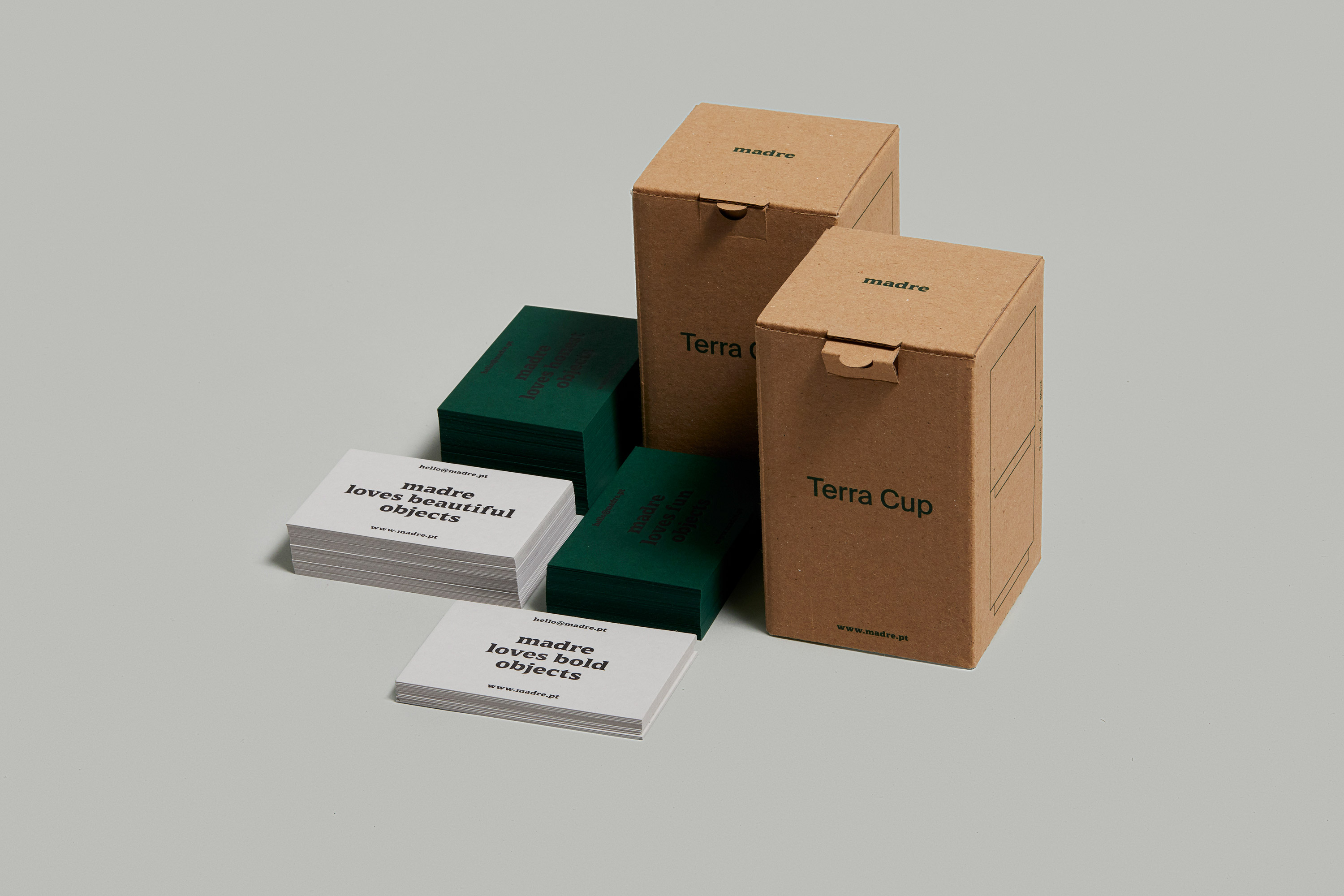
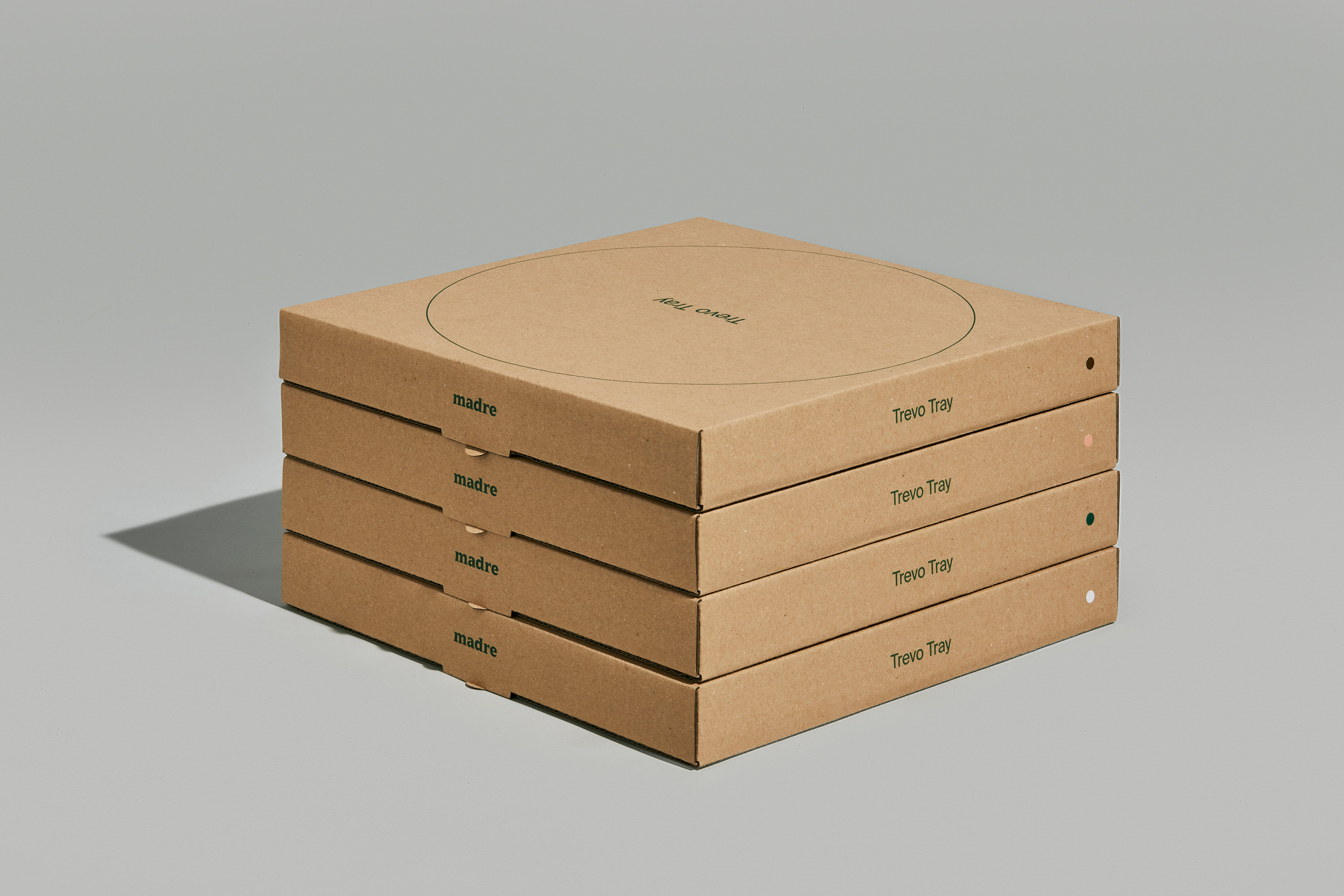
The packaging was thought in a way so that each box can accommodate more than one product just by adding a colored paper label that identifies the piece or the color.
☺︎ This project was designed in collaboration with Raquel Rei. ☺︎