S-E ARCHITECTURE
BRAND IDENTITY
2019
S-E Architecture 2019 S-E is an architecture studio that projects in a critical and anthropological way, valuing the fieldwork and the time maturation of each project.
Despite its pragmatic vision, the studio has a main focus on research and experimentation of materials and techniques, crossing artisanal and technological processes that lead to integrated and specific solutions.
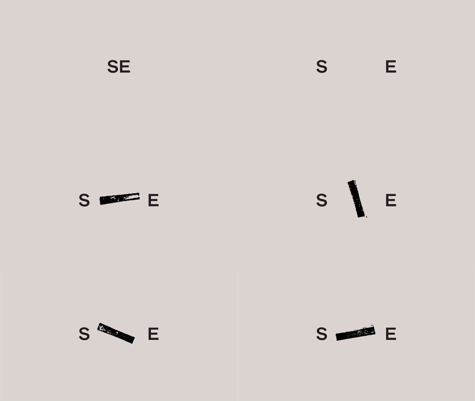
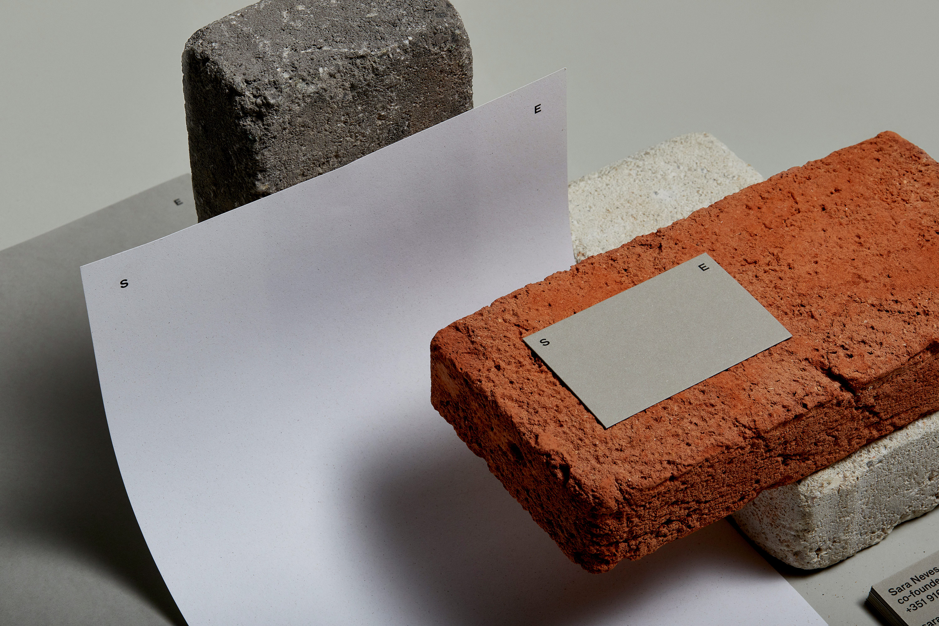
Standing for the two founder’s names, the acronym can also be read as “IF”, which opens a space for possibilities, describing the studio’s modus operandi, of questioning rather than giving any premeditated answers.
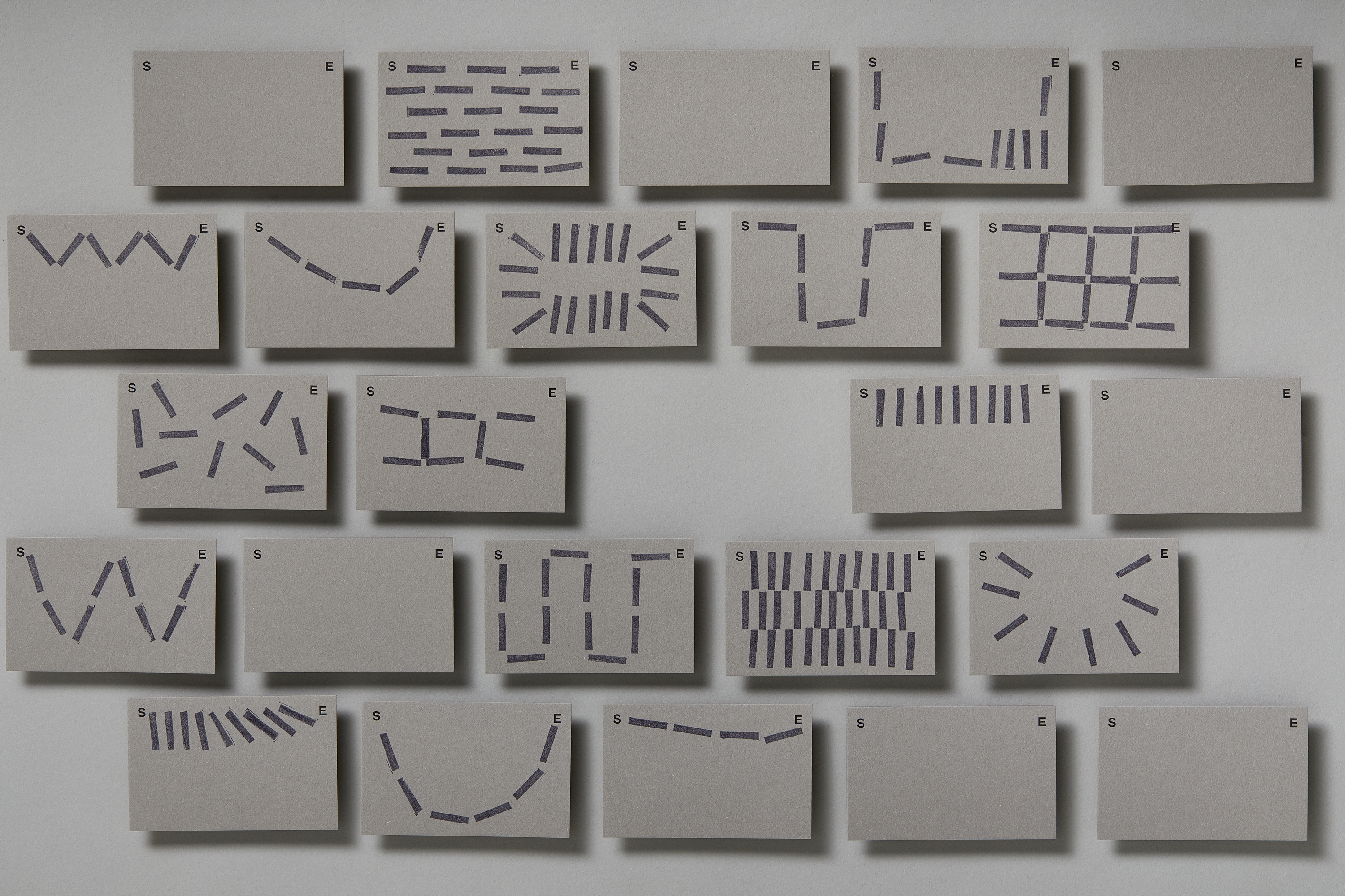
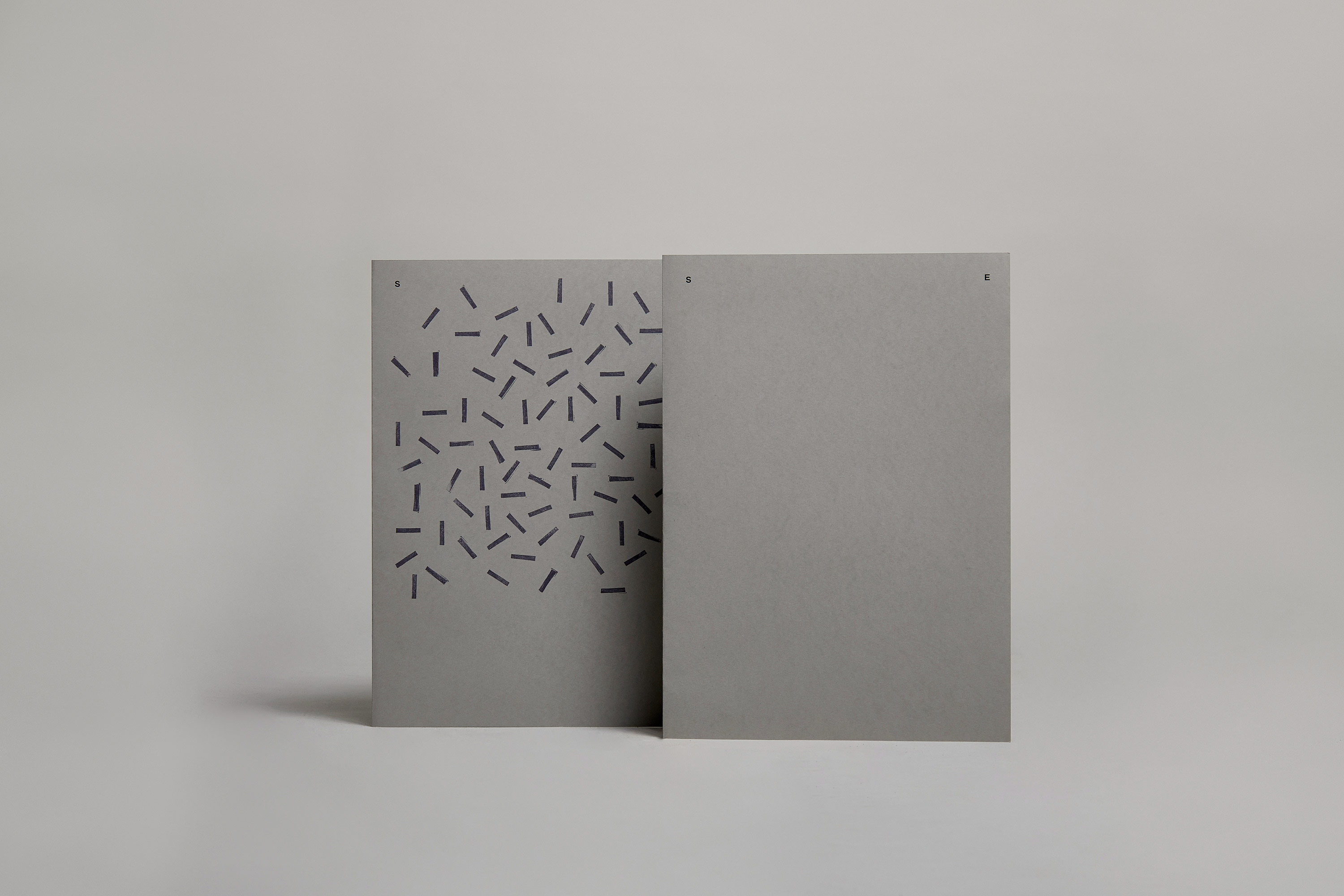
With this meaning behind the name, we created a flexible system, that represents both the polarity of the duo’s personalities and the boundaries for a space of exploration, where ideas, sketches and solutions can meet, through organic and tactile shapes, bringing experimentation and possibility to the center of the identity.
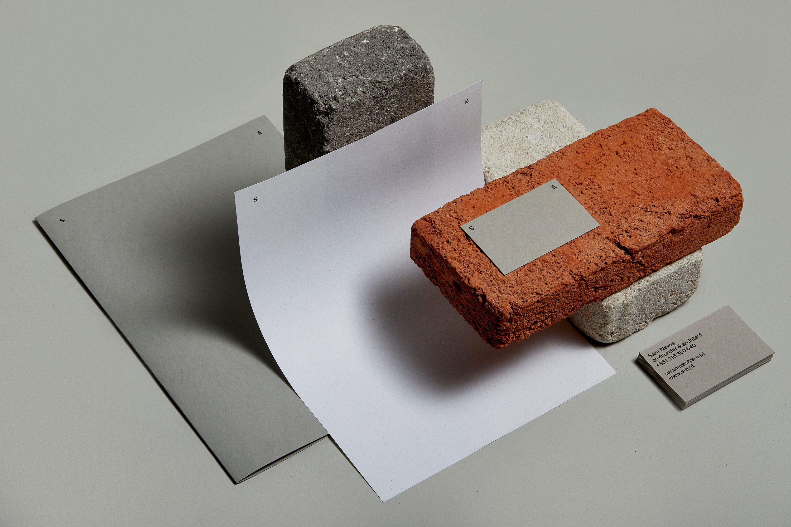
The result is a clean, structured and gestural identity, that works as a blank canvas, ready to be shaped, interacted and to reveal solutions for each project. The printing materials can be illustrated in multiple ways, using the stamp, a low-fi and practical tool, that holds a tactile and more organic expression.
The website exposes this experimentation, allowing the users to use the homepage to explore new shapes and links between the name of the studio.
☺︎ This project was designed as part of studio Degrau with the talented: João Castro, Raquel Rei e Tiago Campeã . ☺︎
